Create Muk Bottom Sheet #
To create Muk bottom sheet, create and select MukUICanvas, right-click in the Hierarchy > Muk > Bottom Sheet. You will see a new object(MukBottomSheetCanvas) created in the scene.
There are two child in the MukBottomSheetCanvas, MukuttonSheet and Viewport.
MukuttonSheet is the actual MukComponent, where you can customize the setting (For details please see the table below.
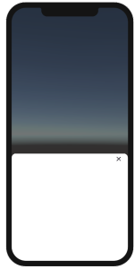
There is a object – Content in the Viewport, You can put your content in this object.
You can show the Bottom sheet using the code below.
using Muk2;

[SerializeField] private MkuBottomSheet mkuBottomSheet;

//mkuBottomSheet
public void ShowBottomSheet()
{
    mkuBottomSheet.ShowBottomSheet();
}

public void HideBottomSheet()
{
    mkuBottomSheet.HideBottomSheet();
}
Muk Bottom Sheet- Properties #
Property | Desciption | Value |
|---|---|---|
Platform Type | Which UI Platform should Muk Components display. | Device - Base on device. iOS UI for iOS device, Material design for others. iOS - iOS design. Material - Material design. |
Material Version | Which Material design version to use. | Material_3 - Use the Material 3 design. Material_2 - Use the Material 2 design. |
Dark Mode | Use Dark mode or light mode. You can set color for each mode in theme settings. | Dark - Dark Mode. Light - Light Mode. |
Show Preview | To view the preview in edit mode. Since it will be hidden when the scene is in play mode. | |
Is Show Handle | Show the handle on top . | |
Is Show close button | Show the close button on the top right. | |
Is Dismiss by background | Can close if the background barrier is touched. | |
Barrier Color Property | The Barrier color. | You can choose iOS / Material Color from the drop down list, this list is from MukAppThemeData. If there's no color you like, you can tick the Override color property, then choose the color you like. If ticked, it will show two options - iOS & Material, and each option will have two options inside(Light Mode color / Dark Mode Color). |
Background Color Property | The background color. | You can choose iOS / Material Color from the drop down list, this list is from MukAppThemeData. If there's no color you like, you can tick the Override color property, then choose the color you like. If ticked, it will show two options - iOS & Material, and each option will have two options inside(Light Mode color / Dark Mode Color). |
Handle Color Property | The handle color. | You can choose iOS / Material Color from the drop down list, this list is from MukAppThemeData. If there's no color you like, you can tick the Override color property, then choose the color you like. If ticked, it will show two options - iOS & Material, and each option will have two options inside(Light Mode color / Dark Mode Color). |
Min Position | The min size of the sheet. | |
Max Position | The max size of the sheet. | |
Starting position | Where do the sheet set when displayed. |