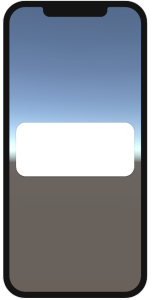
Create Muk Card #
To create Muk card, create and select MukUICanvas, right-click in the Hierarchy > Muk > Card. You will see a new object(MukCard) created in the selected canvas or the first canvas in the Hierarchy (if no canvas is selected). If there’s no canvas in the Hierarchy, Muk will create a MukUICanvas for you and place the MukCard in the newly created MukUICanvas.
Muk Card- Properties #

Property | Desciption | Value |
|---|---|---|
Platform Type | Which UI Platform should Muk Components display. | Device - Base on device. iOS UI for iOS device, Material design for others. iOS - iOS design. Material - Material design. |
Material Version | Which Material design version to use. | Material_3 - Use the Material 3 design. Material_2 - Use the Material 2 design. |
Dark Mode | Use Dark mode or light mode. You can set color for each mode in theme settings. | Dark - Dark Mode. Light - Light Mode. |
Card Type | You can have different types of card. | ELEVATED - has shadow FILLED - No Shadow OUTLINED - There is a stroke |
Background Color Property | The background color | You can choose Material Color from the drop down list, this list is from MukAppThemeData. If there's no color you like, you can tick the Override color property, then choose the color you like. If ticked, it will show one options - Material, and it will have two options inside(Light Mode color / Dark Mode Color). |
Outline Color Property | The stroke color of the card | You can choose Material Color from the drop down list, this list is from MukAppThemeData. If there's no color you like, you can tick the Override color property, then choose the color you like. If ticked, it will show one options - Material, and it will have two options inside(Light Mode color / Dark Mode Color). |
Override Radius | If you want to change the radius | |
Radius | The radius you want to override | |
Stoke Width | The width of the stroke if card type is set as OUTLINED |
